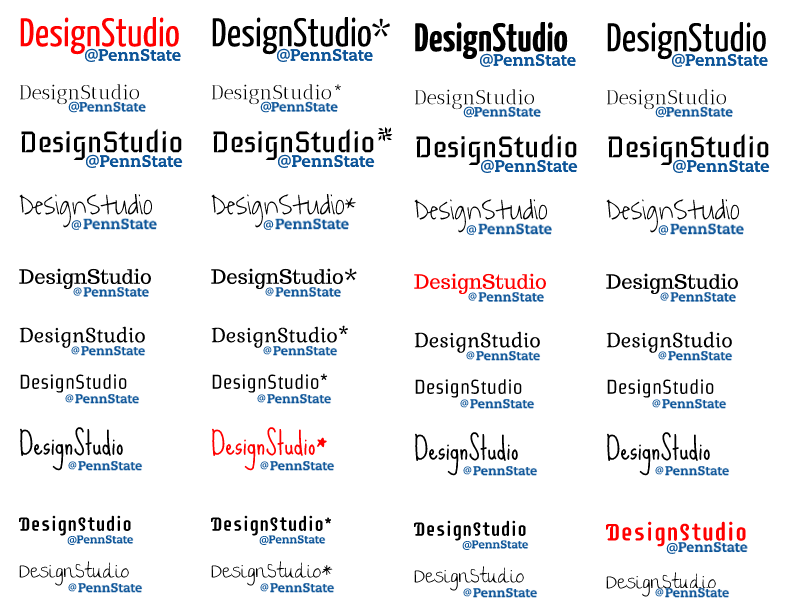
Thinking of ways to capture the essence of Design Studio in the form of a logo, I wanted to find a quality font. There are endless options to choose from, so for inspiration, I headed over to one of my favorite sites, DaFont.com, and began to visualize how I wanted the words “Design Studio” to look.
The site makes it easy to type your text into the site, and immediately see how it renders by using the “Custom Preview” option. Font files can be downloaded for free and installed in the operating system directory, for use in any of your system’s software suites.
Once I compiled a list of potentials, I began to identify elements that I was looking to incorporate. The addition of Penn State branding, provided a professional touch, and I like how it nested under the descender. This narrowed down the list, so I began starring (*) my favorites.

Interestingly, the asterisk added something extra to the design when it remdered as a five-point star, and matching it with the Penn State color, I decided to incorporate it with the Sue Ellen Francisco font. While this option is labeled for personal use, it is possible to contact the creator for commercial licensing. Adding an at symbol (@) to the final design reminded me of a Twitter handle, and helped communicate the emphasis on technology over the duration of the course.
Worth noting, I found a very convenient and free alternative to Adobe Illustrator called, Gravit.io. Residing entirely online, a simple sign-up process allows you to save and export work without needing to rely on sending files to yourself if you happen to use multiple devices.

