AJAX Uploader

[ajax-file-upload unique_identifier=”AJAX Uploader”
max_size=10000
set_background_image=”.cover-photo-container”
allowed_extensions=png,jpg,bmp,gif,txt,mp3,mp4,3gp,avi,mov
on_success_set_input_value=”#my_hidden_input”
on_success_alert=”Your file was successfully uploaded!”
set_background_image=”.cover-photo-container”
set_image_source=”img.profile-pic”
on_fail_alert=”We’re sorry. Your file failed to upload.”
on_fail_alert_error_message=”true”
on_success_set_input_value=”#my_hidden_input”
on_success_dialog_prompt_value=”Upload Complete! Copy the URL below to save your upload.”]


Project: The above AJAX uploader was configured to accept the following file extensions: png, jpg, bmp, gif, txt, mp3, mp4. If you would like to produce an error, please choose an unlisted format.  

The three buttons allow visitors of all access levels to select, upload and remove files. Upon successfully adding files to the media library through the uploader a pop-up displays an unpublished URL that allows contributors to access the file at a later date.

jQuery Essentials: Webform

Primary Objective: In this module, HTML5, CSS, jQuery and jQueryUI was used to create a web form that is easy to use, and incorporates the following functionality:

  • Date picker
  • Drop-down menu
  • Checkbox to show/hide additional fields
  • Submit button and related action

This project was challenging, as I was hoping to create a form that I would actually use. Because I often have guests staying at my place, I thought it would be fun to create a form that allowed people to simply submit reservations on a first come, first served basis that would forward to my personal email.
 

The Arrival/Departure date picker provides information related to how long a prospective guest would like to stay. Using a drop-down menu allows users to choose their desired Sleeping arrangement and the date and time that this is submitted places priority to earlier reservations.

Additionally, in the event that a guest would require special accommodations, they may indicate this by choosing Yes, and allowing a text field to display in order to provide details that will determine if they will be able to be comfortable during their stay. The flexibility of the text box allows one to disclose any difficulties related to illness or disabilities that might prohibit them from staying at my place.

Upon clicking Submit at the bottom of the form, visitors receive the following message: Your form was successfully submitted, and will receive a custom email that includes the name field and a verification link to ensure that everything was received correctly.

Creating a Photo Gallery

Though I am not one to identify with the title of photographer I do take a lot of pictures. Creating galleries to be viewed on my website is something that I always wanted to do, as it allows me to take ownership of my images outside of traditional social media channels.

The following gallery was created with photos takes over the course of the semester and the act of curating images that show my activities over this period in time was quite fun. Visually reflecting on these moments through adding tags was a wonderful exercise that reminded me of what Google is doing with Photos. This platform uses AI to categorize images and actually identify what is being uploaded.

Integrated with search functionality,  my tagging process was quite personal as I attempted to emphasize key elements related to how the photo was captured, as well as what words adequately describe the subject if I would like to leverage the same search functions within my own gallery. This information was used to create an interactive tag cloud which displays pictures related to that tag. Though this is a manual process, the practice of structuring data in order to provide a more fluid user experience when navigating large sets of images is quite fun, and I am looking forward to expanding on such functions in my future updates.

PROJECT: Choose a photo gallery, either one you created in the lynda.psu.edu exercises or from another photo gallery plugin, and use what you know about jQuery and CSS to modify it and make it your own.


Enhanced Accordion Menu

The enhanced accordion attached below builds off of the jQuery accordion constructed in Level I of Design Studio. Please feel free to expand the menu items below for a list of improvements and custom elements that have been incorporated in this latest iteration.

This is an updated version of the accordion created in Level I of Design Studio.
Note the fully responsive design, allowing for easy viewing on a number of devices and screen resolutions.
While the original accordion included similar functionality, menus have been updated to incorporate icons for additional context.
Updated functions allow for increased control, giving users the ability to expand multiple accordion menu items instead of viewing one item at a time.
Built by modifying an existing WordPress plugin, the enhanced accordion menu allows for increased customization to suit a wide variety of needs.

HTML5 Elements

Upon completing the “Getting to Know HTML5” training modules, I was able to update the code on my site by applying current HTML5 elements to the following areas:

Updates to to HTML5 Doctype
Updates to HTML5 Encoding
Updates to HTML5 Semantic Elements in CSS


[codeblock name=’HTML5 Updates’]

Interactive Canvas Element

Using a Canvas Element, I was able to apply interactive HotSpots to a static image. In the following example, I outlined 11 common desktop items found in a stock image pulled from Pexels.com, and designated unique URLs that direct to their Amazon product pages.

As a fan of Amazon’s affiliate marketing platform, I find this approach to be particularly engaging vs. traditional image hyperlinking, as this process allows for multiple products to be featured in a single photograph. While designating HotSpots for certain shapes did prove challenging, I feel that the ability to bundle links provides an organic experience that promotes exploration for clickable elements within the image, especially when not explicitly mentioned.

Interactive elements include:
Apple iMac 27″ Desktop
Apple Cinema Thunderbolt Display 27″
Apple Magic Trackpad
Apple Magic Bluetooth Mouse
Black Moleskine Classic Hard Cover Pocket Notebook
Blue ecosystem Journal
Apple Magic Keyboard
Rustic Style Wood Succulent Planter
Red Nescafe Mug
Apple iPhone 7
Apple MacBook Pro


HTML & jQuery: Responsive Design

For the second project of the first Level II module of Design Studio, I expanded upon previous knowledge of HTML & jQuery in order to make the website fully responsive.

Primary Objective: Update an existing website that has at least five pages and a navigation menu. Use the techniques covered in the activities to give it an attractive design and make it responsive. It should have at least three breakpoints (mobile, medium, large desktop) but the exact details are up to you.

The source code below allows for set breakpoints to occur at the following screen resolutions:

(min-width: 44.375em) -or- 710px
(min-width: 48.9375em) -or- 783px
(min-width: 56.875em) -or- 910px
(min-width: 61.5625em) -or- 985px
(min-width: 75em) -or- 1200px

These widths designate specific snap points that allow site elements to re-order themselves in order to prioritze important content at the top of the page when viewing the site on a smaller screen.

[codeblock name=’Responsive Grid’]

Introduction to AJAX

PROJECT: In this module, I created an AJAX uploader. Though this works quite well for loading various forms of content for the purposes of this project, I went off topic slightly upon finding inspiration.

Given the technology focus of the blog and the speed in which the field advances, I thought it would be nice to allow guest submissions in the hope of leveraging the collective population to increase the number of topics covered.

Though not relying on AJAX, the form below makes it possible for visitors to submit guest posts to the blog, which are uploaded to WordPress in a queue for administrative approval. The ease in which this integrates with the user interface is accomplished through structured fields, helping to organize data and provide a “checklist” of items that should be included when posting online.

The form includes a site-specific field with regard to existing categories and the ability to upload up to 10 images to accompany post text. Successful submissions reload the page and trigger an email to confirm that the submission was received. Failed events, while rare, trigger from issues related to connectivity, with errors displaying when required fields are not filled out.


Submit Your Blog Post!
Please complete the required fields.
Please select your image(s) to upload.


Working with Graphics: Adobe Photoshop

The fourth module challenged me to first create a photo collage and then apply core concepts to create a second image with Adobe Photoshop. Please click on the hyperlinks below to view project-specific elements.

Part 1: Use the images you gathered in Activity 5 to create a photo collage that describes yourself. Your image should be 1024×768 pixels in dimension and optimized to reduce file size in Photoshop as a jpeg or gif. Incorporate pixel selection, layer creation, merging layers, and cropping.

Part 2: Create a second image of your choosing that incorporates several of the techniques that we’ve covered, or new techniques that you’ve discovered on your own.

Photoshop Composite Image

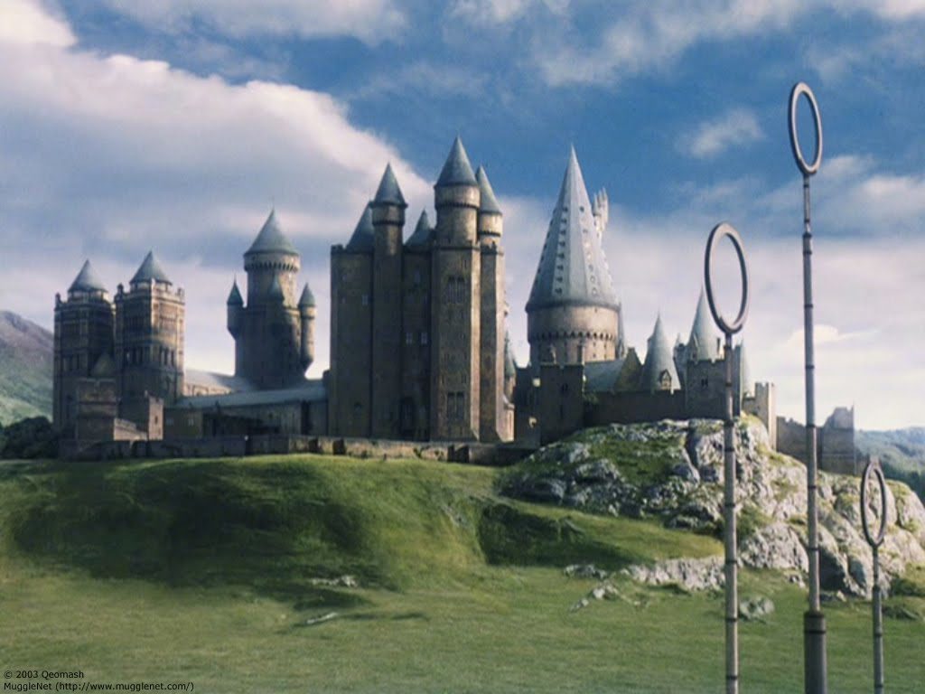
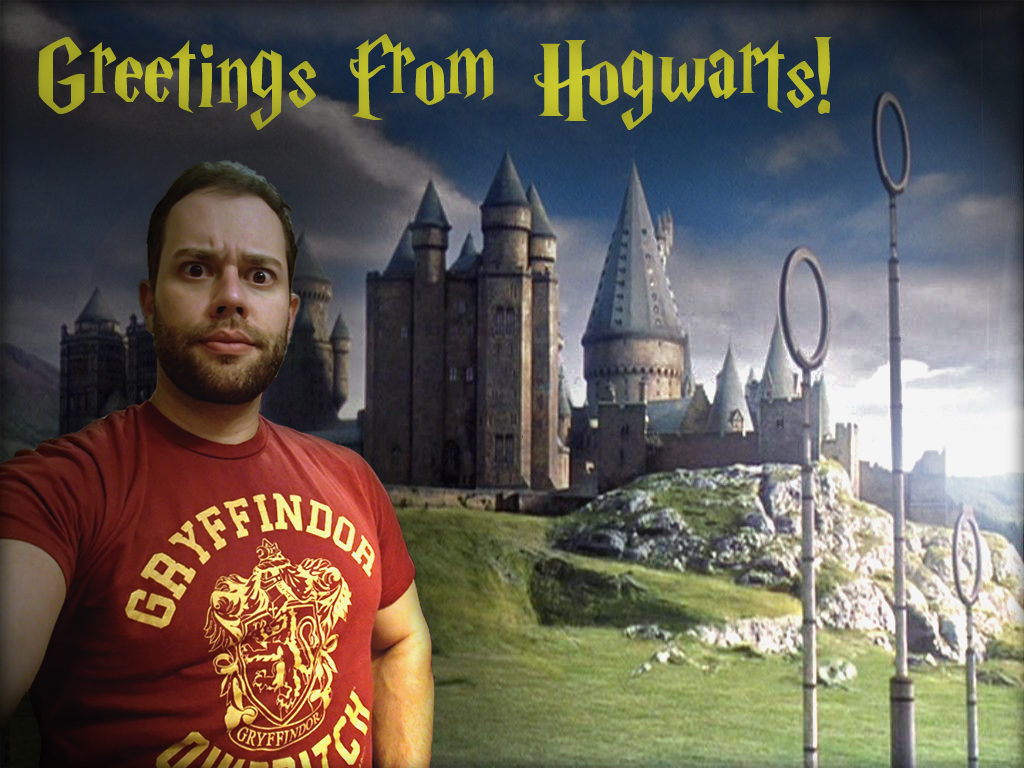
The second portion of the Photoshop module was a free-for-all, and I must admit, I am quite proud of the finished product. Building off of concepts from the photo collage, I decide to insert myself into the magical world of Harry Potter!

Similar to the previous project, I took a picture of myself – this time, wearing my Gryffindor Quidditch t-shirt. Eliminating the background once again proved challenging. In hindsight, this would have been a lot easier if I used more consistent lighting, or employed a chroma key.

While prep for the above photo took some time, the real challenge was making it blend into the 100% digital landscape of Hogwarts attached below. Lacking natural light in the selfie, I found it easier to darken the landscape for a more fluid feel.

6558a12f-69b4-42cd-816e-89f8ad1a30ff

Merging both layers, I was able to adjust the lighting and add a lens flare effect off in the horizon. Simulating a setting sun to the right of the canvas, I was able to work within a darker region to the left – avoiding the need to apply additional effects to the selfie. Applying drop shadows to both layers, helped to increase the detail of the backdrop, and provide a more dramatic feel to overly saturated selfie.

ldt550-photoshop

Finally, I went to DaFont.com and found a Harry P font. Matching the text with the logo color of the shirt helped not only bring these elements into the top of the canvas, but also further solidified the Hogwarts theme for those who may not be immediately familiar with the house of Gryffindor.

Photoshop Collage

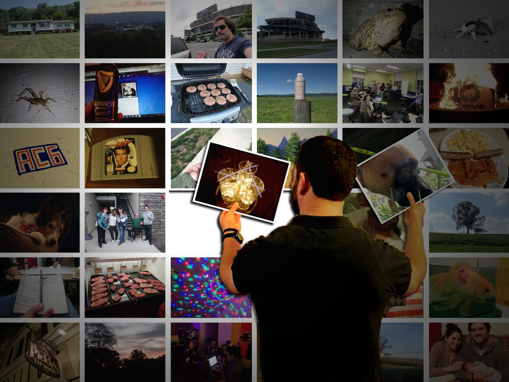
The first portion of the Photoshop module was to create a photo collage that describes myself. Adding several images from my time at Penn State, I was able to put together a fairly comprehensive mosaic of 36 memories.

My first attempt was admittedly bland. While guides helped to create a very clean image, it lacked a certain personality, and did not incorporate several of the skills covered over the course of the training.

ldt550-collage

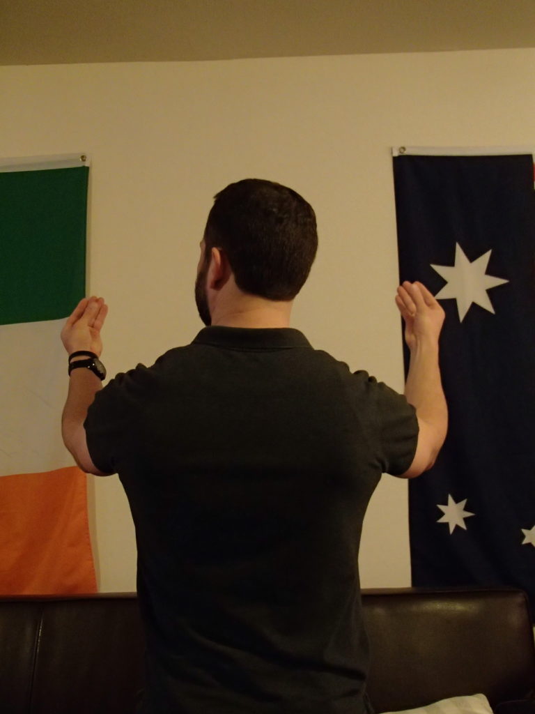
Thinking of ways to take my collage to the next level, I decided to break the fourth wall, and insert myself into the act of creating the collage. Photographing myself from the back with my hands outstretched, I wanted to replicate the process of curation that went into choosing and ordering my photos.

By removing myself from the above photo, I combined this shot with two tiles from the collage in order to create the finished product below.

ldt550a-collage

Though combining and blending the separate layers, I still feel that my image stands out slightly – which may be able to be remedied with some better lighting. Despite this fact, I was especially pleased with the feel of this, considering that there was nothing in my hands when I photographed myself.